Elements
The elements in this section are only available in Filter attribute return object array. The behavior differs a bit from other elements in animation views, and only the filter context object is available. The filter objects are executed in client side only. if interaction with server side is needed, use the context object described in chapter Context.
Date Element
Description
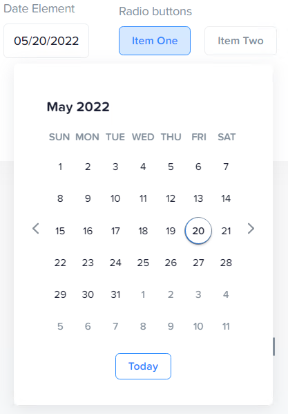
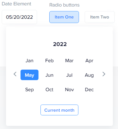
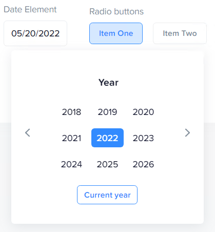
The Date element is used for displaying dates. It is a date picker with possibility of altering the UI and the range depending on current resolution.
Each time a new date, month or year is picked, the eventcode onChanged is triggered.
Resolutions
Day
Set resolution to day to get the day view.
Month
Set resolution to month to get the month view.
Year
Set resolution to year to get the year view.
Attributes
Date element attributes
| Name | Type | Description | Default |
|---|---|---|---|
type |
string | sets the elements type | "Date" |
name |
string | the name of the element | mandatory |
title |
string | the user label of the element | name |
userDescription |
string | the user description of the element | name |
value |
string | the current value of the element | mandatory |
visible |
bool | element visibility | true |
enabled |
bool | if item is active/selectable | true |
resolution |
string | the current resolution, valid values are hour,day,month,year |
mandatory |
onChanged |
function | function with currentConfig as parameter | |
group |
string | number | groups with other element with same group identifier |
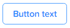
Button Element
Description
The Button renders as a plain button. If button is pressed, the onClicked eventCode is executed.
Attributes
| Name | Type | Description | Default |
|---|---|---|---|
type |
string | sets the elements type | "Date" |
name |
string | the name of the element | mandatory |
title |
string | the user title of the element | name |
text |
string | the user label of the element | name |
value |
string | the current value of the element | mandatory |
visible |
bool | element visibility | true |
enabled |
bool | if item is active/selectable | true |
onClicked |
function | function with currentConfig as parameter | |
group |
string | number | groups with other element with same group identifier |
Toggler Element
Description
The Toggler is a state switch. It indicates inactive and active state. It has a title. When switch is clicked, the onChanged eventCode is executed.

Attributes
| Name | Type | Description | Default |
|---|---|---|---|
type |
string | sets the elements type | "Date" |
name |
string | the name of the element | mandatory |
title |
string | the user label of the element | name |
value |
string | the current value of the element | mandatory |
visible |
bool | element visibility | true |
enabled |
bool | if item is active/selectable | true |
onChanged |
function | function with currentConfig as parameter | |
group |
string | number | groups with other element with same group identifier |
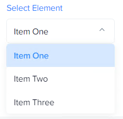
Select Element
Description
The Select element is a select box. It is used for selecting between one of multiple choises. When a new item is selected the onChanged eventCode is executed.
Attributes
| Name | Type | Description | Default |
|---|---|---|---|
type |
string | sets the elements type | "Date" |
name |
string | the name of the element | mandatory |
title |
string | the user label of the element | name |
value |
string | the current value of the element | mandatory |
visible |
bool | element visibility | true |
enabled |
bool | if item is active/selectable | true |
onChanged |
function | function with currentConfig as parameter | |
data |
array | Array of item objects, see below | empty array |
group |
string | number | groups with other element with same group identifier |
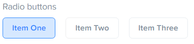
Radio
Description
The Radio element is an array of buttons. It can be configured, via the multi attribute set to true, to allow toggling of multiple buttons in the array to be active at the same time. This can be useful when combining settings, or multiselect of ranges is needed. Each time a button is pressed the onClicked eventCode is executed.
multi:false
Each activation of a new button deselects all other buttons in the array.
Note
The value of this element is always an array of values, even if the multi attribute is set to false. To get the value of the element if multi is false, it is available by indexing the value:
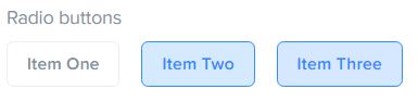
multi:true
Button state is independent of each other and are toggled independently.
| Name | Type | Description | Default |
|---|---|---|---|
type |
string | sets the elements type | "Date" |
name |
string | the name of the element | mandatory |
title |
string | the user label of the element | name |
value |
array of values | the current array of item values of the element | mandatory |
multi |
bool | allow multi on/off state | mandatory |
visible |
bool | element visibility | true |
enabled |
bool | if item is active/selectable | true |
onClicked |
function | function with currentConfig as parameter | |
data |
array | Array of item objects, see below | empty array |
group |
string | number | groups with other element with same group identifier |
Select and Radio element data Items
| Name | Type | Description | Default |
|---|---|---|---|
title |
string | The title of item | mandatory |
value |
string | number | null | The value of item | mandatory |
visible |
bool | item visibility | true |
enabled |
bool | if item is active/selectable | true |
group |
string | number | groups with other element with same group identifier |
Grouping elements
All elements with the same group identifier (for example "group1") is grouped and can share the same filter row (if space exists). The index for the group with the first found group element index.